Post processing
Last reviewed version: 2.18.0The filtered data can be viewed in terms of time series or a current rose. These options are found in the Result option.
We would like to first view the results in terms of time series. From the Result option, select View Speed/Time Graph.
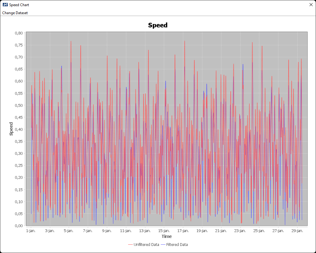
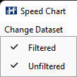
The red line is the unfiltered raw data, and the blue is the filtered. The view can be toggled on and off from the Change Data set option, in the upper left corner.
Plot the current rose by selecting Result > View Current Rose.
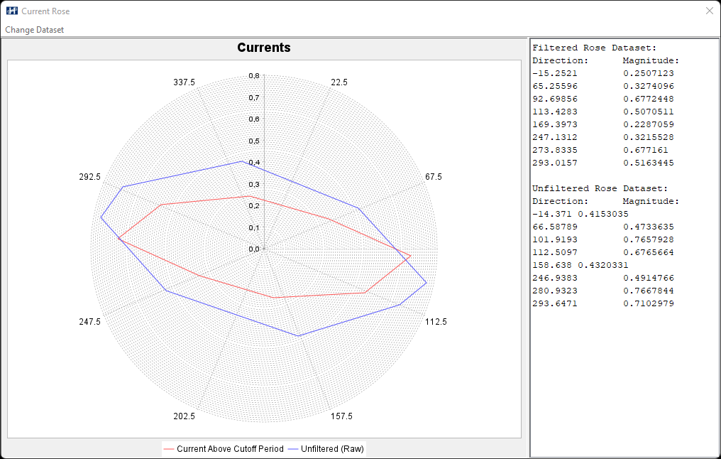
The diagram is divided into 8 sectors, according to what was specified in Number of directions in the filter condition section. The blue line represents unfiltered data, and the red line is the filtered data. By selecting Change Data set > Current within Tidal Frame one can visualize the results within Harmonic lowest- and -highest period (green line).
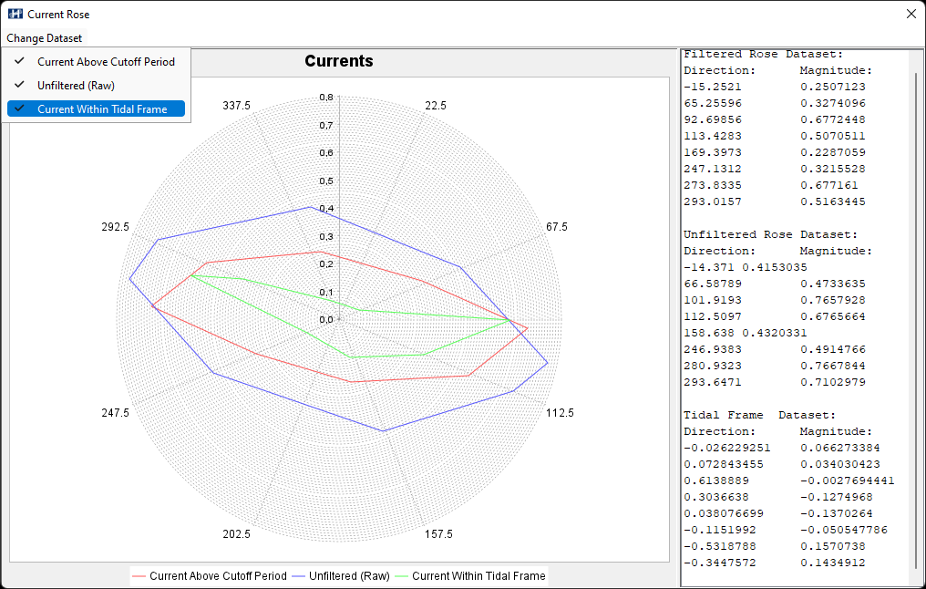
The table to the right in the Current Rose window can be marked and copied to the clipboard for further processing.